


Your team already has the data. The problem is usually the same: a stack of dashboards, a weekly report nobody opens twice, and a Monday meeting where people agree the numbers look “interesting” and then go back to work. In agencies and SMBs, analytics and reporting only matter when they change a decision, like where to spend next week's budget, which lead source to call first, or which campaign to pause before it wastes more time.
That's where the confusion starts. Reporting shows what happened. Analytics explains why it happened and what to do next. If your reports don't lead to action, you're not missing more data, you're missing a decision system, and bad inputs only make that worse, which is why resources on the impact of poor data quality are worth reading before you blame the dashboard itself. If you want a practical way to reduce manual work while keeping the team aligned, you can also streamline agency processes with automation.
Table of Contents
- Why Most Agencies Look at Data but Make No Decisions
- Reporting Versus Analytics in Plain Language
- The Metrics That Actually Move Revenue
- Designing Dashboards That People Actually Read
- Attribution Models and How to Choose One
- Setting Up Analytics and Reporting in HighLevel
- Common Pitfalls and How to Avoid Them
- Your Weekly Reporting Rhythm
Why Most Agencies Look at Data but Make No Decisions
The pattern is familiar. An account manager has thirty browser tabs open, each one showing a different chart. The owner asks for “the numbers,” the team shares a deck, and everyone nods because there are plenty of charts and almost no disagreement. Then the meeting ends, and nothing changes, because nobody agreed on which number should trigger which action.
The dashboard trap starts with too many inputs
Reporting turns into noise when every channel gets equal space. A team can stare at impressions, clicks, open rates, and follower growth, but none of those numbers answer the agency's real weekly questions, which are usually about leads, booked calls, and pipeline movement. The difference matters here, because reporting organizes and presents data, while analytics examines that data to identify patterns and generate insights for action. A dashboard can look full and still be useless, because it shows activity without telling the team what to do next.
Practical rule: if a metric does not change a decision this week, it belongs in a secondary view, not on the main screen.
The same problem shows up when reporting is built around the tool instead of the workflow. A lead form report, ad dashboard, and CRM pipeline view can all be correct and still leave the operator guessing which lead source deserves follow-up. Bad inputs make that gap worse, and the impact of poor data quality shows up fast when teams trust incomplete or inconsistent records. That is the distance between “we have data” and “we can operate from data.”
The fix is a decision-first workflow
A better starting point is simple. Pick a narrow KPI set, then add trend context and a short explanation. One reporting workflow in the field recommends a weekly structure with headline numbers, traffic-source split, top pages, and a short key takeaway, plus monthly reporting for executives and daily reporting only for time-sensitive campaigns, because the report should match the pace of the decision, not the amount of available data (Qlik on reporting and analytics).
That same logic explains why modern reporting moved away from dense documents. Guidance on operational reporting emphasizes scheduled, audience-specific outputs, with real-time updates for critical operational metrics and monthly or quarterly updates for strategic analysis (Alphaus on reporting and analytics for growth). When the cadence fits the decision, the report gets used. When it doesn't, it gets archived.
For agencies, this also means the report should map to a weekly operating rhythm. The account lead needs to know which campaigns need budget changes, which leads need follow-up, and which client accounts need a status update. That is easier to manage when you streamline agency processes with automation so routine checks, alerts, and handoffs do not depend on someone remembering every step.
The goal is not to know everything. The goal is to know what changed, why it changed, and what you are going to do about it before next Monday.
Reporting Versus Analytics in Plain Language
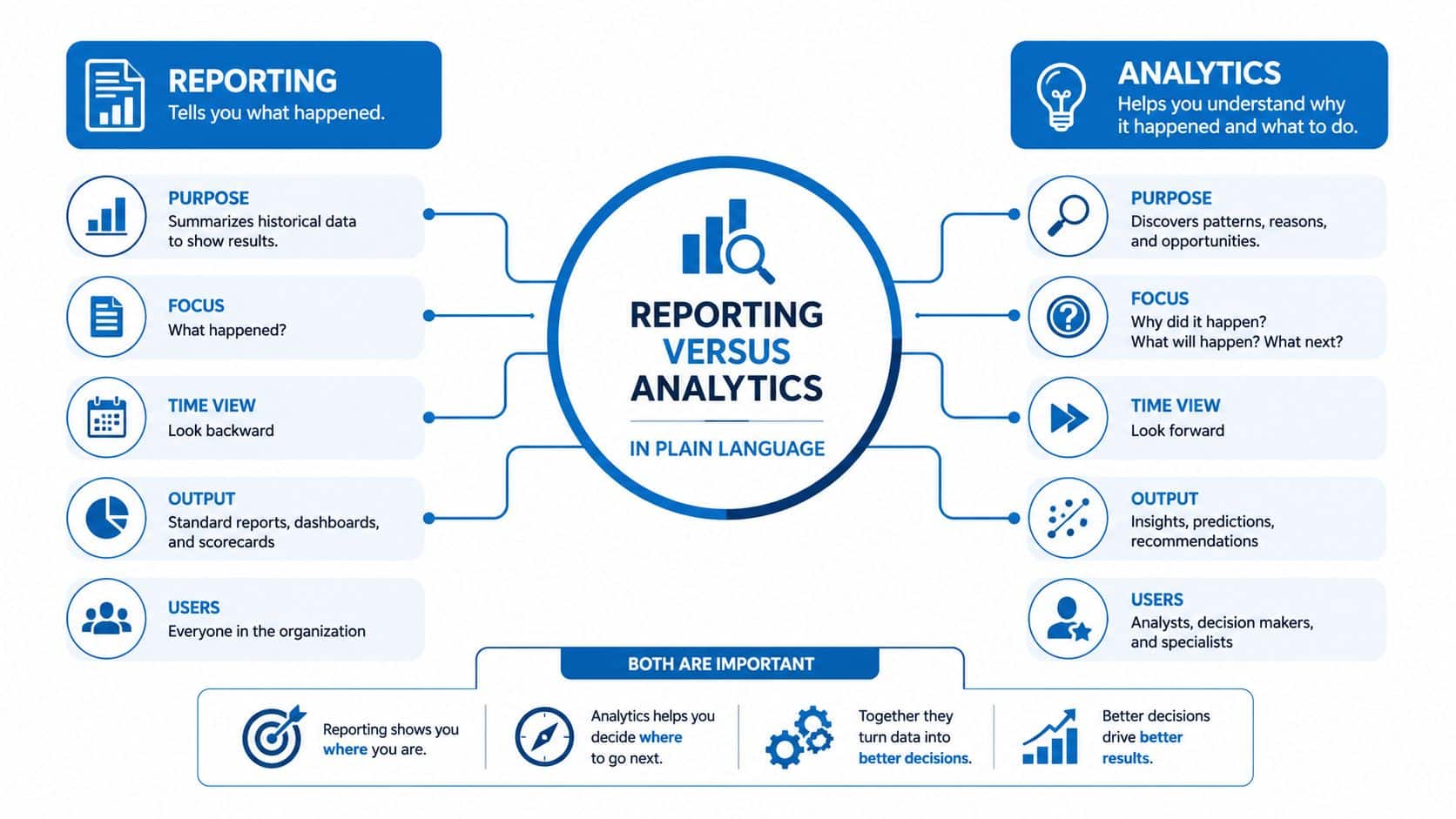
A campaign report can say leads dropped this week. Analytics explains whether the drop came from weaker traffic, a landing-page problem, or a follow-up issue. That difference matters because agencies and SMBs do not get paid for knowing the number, they get paid for deciding what to do next.
Reporting is structure, analytics is interpretation
Reporting answers what happened. It organizes data into dashboards, tables, charts, and summaries so the state of the business is easy to scan, whether someone is checking campaign health, pipeline progress, or client results. Analytics answers why it happened and what to do next. That can mean comparing traffic sources, reviewing stage drop-off in the pipeline, or reading customer feedback beside the numbers.
The distinction gets blurred when a team tries to make one screen do both jobs. A report loaded with every possible metric and a full block of commentary usually does neither thing well. It is too slow for the operator who needs a quick check, and too shallow for the owner who needs a decision. Keep measurement in one layer and interpretation in another, then connect them with a clear next action.
Cadence should match the audience
Operational teams need faster reporting than owners do. Current guidance points to critical operational metrics updated in real time and strategic analysis updated monthly or quarterly, with automation reducing manual effort (Alphaus). A campaign manager may need a daily view of response data, while an owner may only need a monthly summary of pipeline quality and closed revenue.
A practical pattern looks like this. Weekly reporting is for decisions already in motion, monthly reporting is for course correction, and daily reporting is only for work that can break fast.
Output should be designed by audience, not by metric source. A weekly operating report can show headline numbers, a source split, top pages, and a short takeaway. An executive report can condense the same information into fewer lines because leaders usually need direction more than detail. Dense reports often fail for a simple reason, they try to serve everyone and end up helping no one.
For agencies, the report should also fit the weekly operating rhythm. The account lead needs to see which campaigns need budget changes, which leads need follow-up, and which client accounts need a status update. That is easier to manage when you use HighLevel's agency setup guide to connect routine alerts, reminders, and handoffs so the team is not relying on memory.
A simple test for every report
Before you add a chart, ask three questions.
- Who uses this report?
- What decision does it support?
- What changes if the number moves?
If you cannot answer all three, the report is decoration. If you can, it becomes a working tool instead of a data museum.
The Metrics That Actually Move Revenue
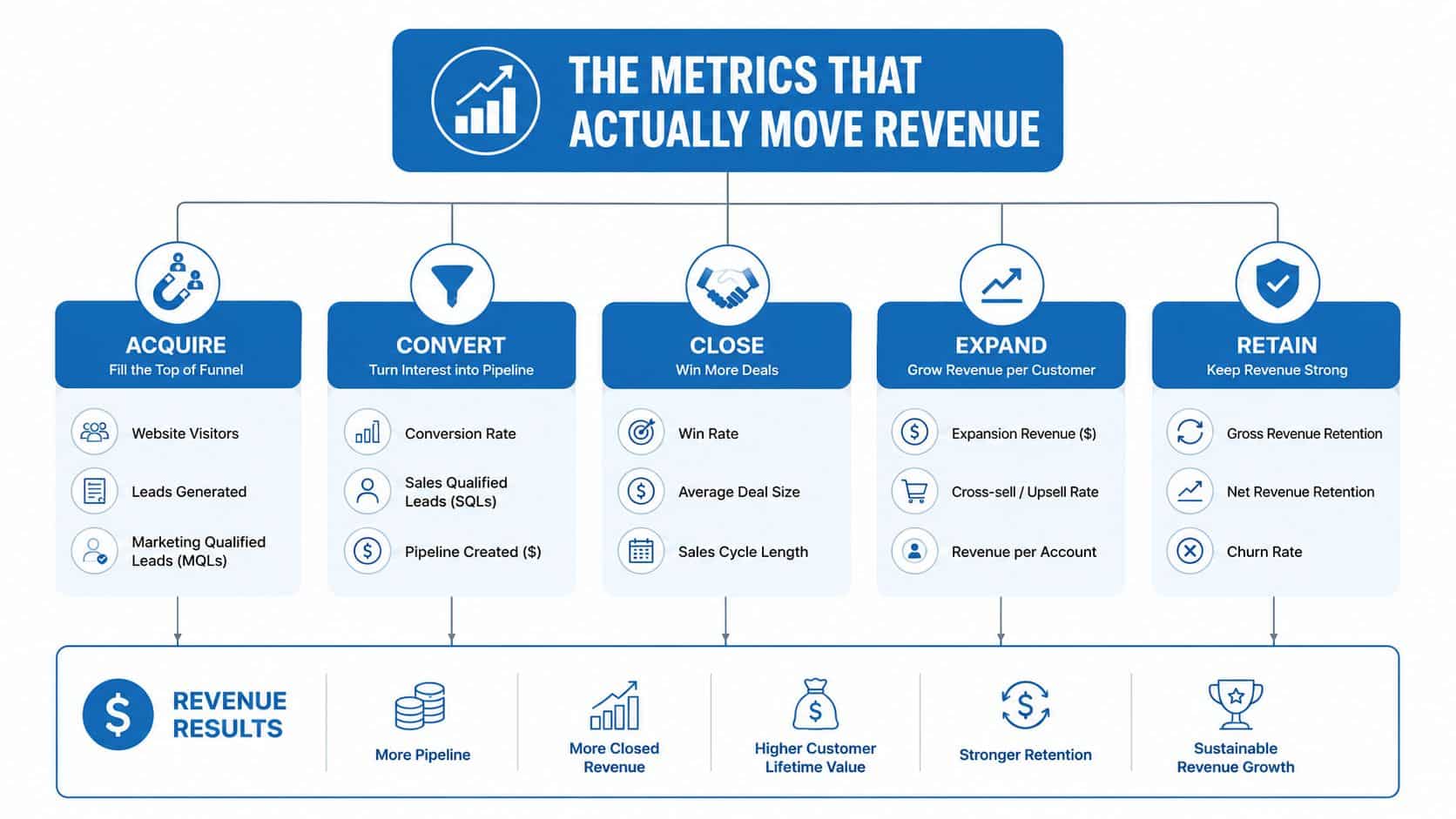
The best metric set for an agency or SMB is small enough to read quickly and strong enough to change behavior. Group the numbers by the decision they support, not by the platform that produces them. That usually means acquisition, conversion, and retention, because those are the three places where teams decide whether to spend, follow up, or improve the customer experience.
Acquisition tells you where demand starts
Acquisition metrics answer one simple question, where did the lead come from and how expensive was that path? Start with cost per lead by channel, lead-to-contact rate, and source attribution mix. Those three numbers tell you whether the channel is producing cheap volume, whether the team is reaching leads, and whether the mix is too dependent on one source.
The common mistake is treating every lead source as equally valuable. A channel that creates lots of inquiries but few conversations is not the same as a channel that creates fewer but better leads. An agency owner should read acquisition data as a quality conversation, not just a volume report.
A channel that wins on raw lead count can still lose if the sales team can't reach or qualify those leads fast enough.
If you need a practical setup example, the HighLevel's agency setup guide is a useful reference point for connecting missed calls and response workflow to lead capture. That matters because acquisition is not just about traffic, it's about turning attention into a contact that can be worked.
Conversion shows where deals move or stall
Conversion metrics belong to the middle of the funnel, where interest becomes pipeline and pipeline becomes revenue. Track pipeline stage conversion, show rate, close rate, and average deal value. Together they tell you whether leads are advancing, whether appointments are being kept, whether the team is closing, and whether the deal mix is healthy.
The most common misread is blaming close rate too early. If show rate is weak, the issue may be the booking process, reminders, or lead quality. If deal value is low, the issue may be offer design or qualification. Conversion metrics work best when they're read as a chain, not as separate trophies.
Retention tells you whether growth sticks
Retention metrics are often ignored because they sit after the sale, but they shape the business more than many teams admit. Use customer lifetime value, churn rate, repeat purchase rate, and review velocity. These numbers tell you whether the business keeps value after the first transaction and whether customers are willing to come back or recommend you.
If you're choosing a North Star metric, pick the one that best reflects the result you want, then make the other metrics support it. For an agency focused on booked revenue, pipeline and close metrics matter more than surface activity. For a local SMB, repeat purchase and review patterns may matter more than raw lead count. The right North Star is the one that forces tradeoffs in the right direction.
Designing Dashboards That People Actually Read
A dashboard earns attention when it answers a specific question fast. It loses attention when it tries to be the whole business in one screen. The best layouts are built around the decision the viewer has to make, not the number of widgets the platform can display.
Five rules keep a dashboard usable
Start with one headline number per audience. Then add comparison context, like this week versus last week or this campaign versus your normal benchmark. Keep the visual count tight, because a crowded screen pushes people into scanning instead of thinking. And always place an action prompt near the chart so the viewer knows what the number is meant to trigger.
The layout rules are simple enough to remember:
- Design for the decision, not the data: every chart should support one action.
- Lead with one headline number: one audience, one front-page signal.
- Show comparison context: raw totals are weak without a frame of reference.
- Limit the screen: five to eight visuals is usually enough for a working view.
- Pair each chart with a prompt: “pause,” “fix,” “investigate,” or “send” gives the number a job.
Different audiences need different layouts
An owner dashboard should compress into a short answer about revenue, pipeline, and risk. A marketing manager dashboard should show source mix, campaign movement, and response speed. A client-facing dashboard should keep the story narrower, because the client wants the business outcome, not every internal lever.
| Dashboard type | Primary audience | Headline KPIs | Refresh cadence |
|---|---|---|---|
| Owner dashboard | Agency owner or SMB owner | Pipeline health, booked revenue, major channel shifts | Weekly |
| Marketing manager dashboard | Campaign manager or operator | Lead volume, response speed, conversion movement | Daily or weekly |
| Client-facing dashboard | External client | Leads, booked calls, key campaign outcomes | Weekly or monthly |
A reusable template helps the team stay consistent. Put the KPI table on the left, the trend chart on the right, the alert log at the bottom, and a short commentary above it that says what changed and what action comes next. That structure works because it makes the report readable before it becomes discussable.
If your stack keeps expanding, optimizing your agency's tech stack should always start with the reporting job first. Tools are easier to defend when each one owns a clear output.
Attribution Models and How to Choose One
Attribution becomes contentious the moment channel owners start arguing over credit. The fix is not to find a perfect model, because there isn't one. The fix is to choose a model that's easy to defend, fair enough for your sales cycle, and practical enough for the team to maintain.
Start with the model that fits the decision
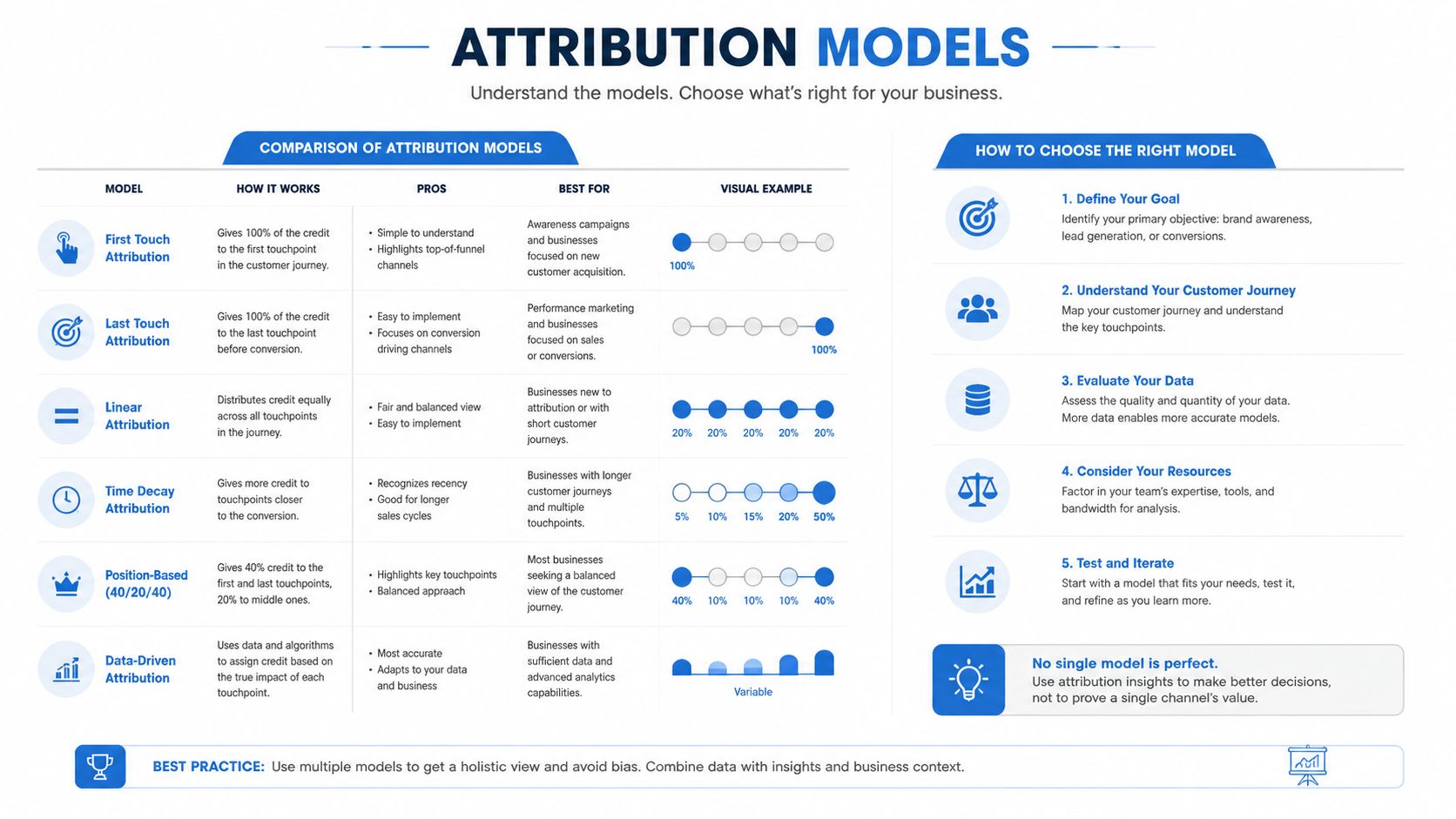
First-touch attribution gives all credit to the first interaction. It's simple, but it ignores everything after discovery. Last-touch attribution gives all credit to the final interaction before conversion. That's easy to explain, but it can overvalue closing channels and undercount demand creation.
Linear attribution spreads credit evenly across touchpoints. It feels fair, but it can flatten the differences between a light touch and a decisive one. Time-decay attribution gives more weight to touches closer to conversion, which usually fits longer buying cycles better than first-touch or last-touch alone. Position-based attribution gives credit to the first and last touch while still recognizing the middle, which is why many small teams find it easier to defend.
Use a model you can explain to the team
Data-driven attribution sounds appealing because it looks more advanced, but it also asks more from the data and the organization. Most agencies and local SMBs are better served by a model they can explain in one sentence during a weekly meeting. If the team can't understand the rule, they won't trust the report, and they won't act on it.
A practical way to choose is to check three things:
- Setup effort: how much work does the model need before it becomes usable?
- Channel fairness: does it credit the assists you care about?
- Sales cycle fit: does it match a short path or a longer path to revenue?
For most small teams, position-based or time-decay is a solid starting point because both are easier to defend than more complex approaches. If budget and data maturity allow, incremental testing can sit on top later. Until then, the goal is not perfect truth, it's useful consistency.
Setting Up Analytics and Reporting in HighLevel
A reporting system only helps when every metric lands where the team can do something with it. HighLevel brings marketing, sales, and customer engagement in a single mobile-accessible workspace together with a native CRM, conversation inbox, pipelines, call tracking, broadcast campaigns, reputation management, and ad management for Google and Facebook, so a small team can work from one source of truth instead of stitching together spreadsheets and tabs. For a broader setup framework, the HighLevel business operating system approach helps agencies treat the platform as a decision layer, not just a place to store data.
Match each metric to the module that owns the action
The unified conversation inbox belongs at the center of response-time checks and channel-mix checks, because it shows how fast leads are being handled and where messages are coming from. The CRM and pipeline dashboards are where stage conversion and deal velocity should live, because sales movement happens there, and that is where the next action usually starts. The call tracking area is where missed-call behavior and text-back follow-up belong, since those numbers point to an operational response problem, not a marketing problem.
The reputation module is where review velocity and AI reply usage fit, because those metrics connect customer sentiment to a repeatable workflow. The broadcast module is where email and SMS engagement should be watched, since campaign performance is tied to sends and responses. The ad management module is where Google and Meta spend efficiency belongs, because budget decisions should sit beside the channel data that drives them.
Build the first custom views with one job each
Each module should begin with one simple report, not a large custom build that tries to answer every question at once. Start with the default template, then add one custom view that answers the next decision the team needs to make.
- Conversation inbox: track missed conversations, response lag, and source by channel.
- Pipeline dashboard: watch stage conversion, stalled deals, and average time in stage.
- Call tracking: isolate missed-call text-back performance and recurring call sources.
- Reputation: review requests sent, reviews received, and reply activity.
- Broadcast campaigns: compare sends, opens, clicks, and follow-up actions by list.
- Ad management: review spend, lead flow, and campaign-level efficiency by platform.
That setup matters because it keeps the same question from being scattered across three tools. When the inbox, CRM, calls, reputation, broadcasts, and ads all point into one workspace, the report can move directly into action. That is the point of configuration, not prettier charts.
Common Pitfalls and How to Avoid Them
Most reporting failures are predictable. They usually come from the same habits, and each one has a clean correction if the team is willing to change one thing this week. The fix is less about buying a better tool and more about reducing confusion before the meeting starts.
Vanity metrics look good and change nothing
Impressions, follower count, and raw traffic can be useful context, but they become a trap when they replace booked revenue or qualified pipeline. The symptom is a report that looks busy while the business still struggles to grow. The correction is to move the main screen toward decision metrics, then keep vanity metrics in a secondary view if the team still needs them.
One screen for everything helps nobody
Dashboard hoarding happens when every chart gets placed on one page because nobody wants to delete anything. The result is slower reading, weaker prioritization, and more debate about what matters. The fix is to split the report by audience, then keep each view narrow enough that a person can explain it in under a minute.
Nobody owns the action behind the number
A KPI without an owner becomes a trivia item. If response speed drops, who fixes it? If show rate falls, who follows up? If review velocity slows, who sends the request? Every major metric needs a decision owner, or the report just documents problems.
A report without an owner creates shared awareness, not shared responsibility.
Mixed definitions create fake disagreement
A team can spend half a meeting arguing about a number that only looks different because the source definitions aren't aligned. That happens when CRM data, ad data, website data, and feedback data are pulled together without cleaning the definitions first. The correction is to standardize what each KPI means before the dashboard goes live, then document it in the report itself.
Commentary matters more than a bigger chart
A report without written context leaves people guessing about the cause of change. A short written note that says what changed and what action to take next is often more valuable than another graph. If the report can't answer “so what” in plain language, the team will answer it badly in the meeting.
Your Weekly Reporting Rhythm
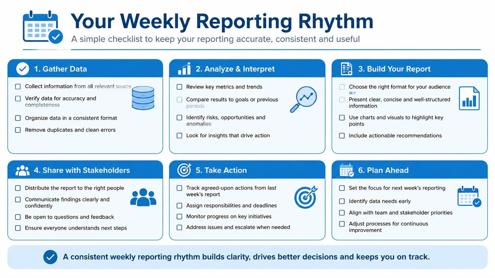
A reporting system gets reliable when it runs on a rhythm. Teams don't need a perfect model before Monday morning. They need a repeatable cadence that tells them what to check, who checks it, and what decision follows when the number moves.
A weekly rhythm keeps decisions moving
Start the week with a 15-minute Monday review of pipeline and broadcast metrics. The owner or account lead checks whether leads are moving, whether response speed is healthy, and whether any campaign needs a fast adjustment. Mid-week, a 30-minute operational dashboard check catches stalled deals, missed follow-up, or a source that needs attention before Friday.
By Friday, the client report should already be assembled from a template, not rebuilt from scratch. That keeps the story consistent and makes the commentary easier to write. Monthly, the team should step back and review cohort trends and attribution shifts so the weekly noise doesn't hide the bigger pattern.
Assign the right person to each checkpoint
A rhythm only works when ownership is explicit. The operator owns the daily or mid-week view. The account lead owns the weekly summary. The owner or strategist owns the monthly review, because that's where broader tradeoffs get made.
This is also where agencies serving partner brands need cleaner workflows. If you're coordinating reporting with B2B marketing agency partners, the handoff has to be tight, otherwise each side ends up translating the same data twice.
Use the same report shape every time
Consistency reduces confusion. Keep the same headline KPI, the same source split, and the same action note in every weekly report. The team learns where to look, and the client or owner starts reading the pattern instead of relearning the layout each time.
If you're building or refining an agency operating model, the blueprint for SaaS agency success is a useful complement to this rhythm because reporting works best when the business model itself is clear. Once the cadence is in place, analytics and reporting stop feeling like a task list and start functioning like the operating system for the business.
HighLevel gives agencies and SMBs a single workspace for CRM, conversations, pipelines, calls, broadcasts, reputation, and ads, which makes it easier to turn analytics and reporting into actions the team can own. If you want to simplify the way your reports connect to follow-up, pipeline, and client communication, visit HighLevel and see how the platform can support that workflow.
