


The market's middle is crowded, but the gap at the top is wide. Recent benchmark reporting shows the top 25% of landing pages convert at 11.45% or higher, while the overall median sits around 4.02% to 6.6% depending on the dataset and methodology, which is why a high-converting landing page is less about polish and more about precision, intent, and friction control. In other words, the pages that win don't try to be useful to everyone. They make one visitor type feel like the page was built for that exact click.
Table of Contents
- What High-Converting Actually Means in 2026
- Define the Goal and Match the Message
- Write Headlines Offers and CTAs That Earn the Click
- Stack Social Proof by Funnel Stage
- Design Layout Forms and Mobile Speed as One System
- Track Test and Decide What to Ship
- Your 30-Day Landing Page Launch Plan
What High-Converting Actually Means in 2026
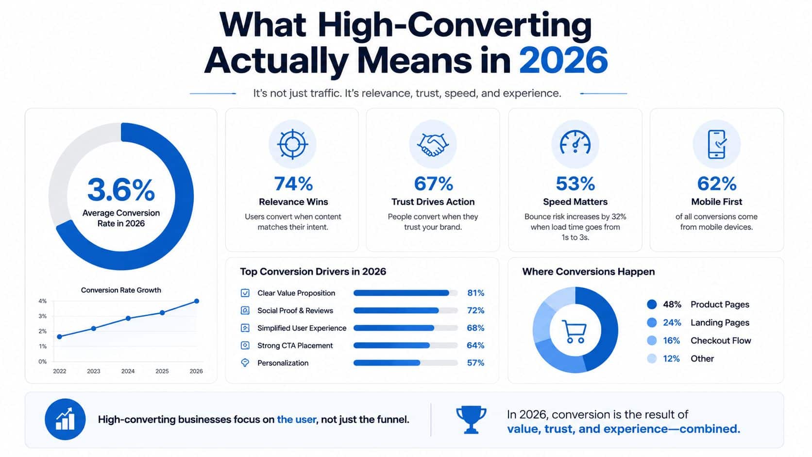
The word high-converting gets abused because people want one universal number. That's not how landing pages work in practice. A useful benchmark is the 6.6% median conversion rate reported across industries, which is often treated as roughly 1 in 15 visitors taking the desired action, but that number only makes sense when you know the traffic source, the offer, and the industry context (involve.me).
Context beats vanity metrics
The same benchmark set shows meaningful vertical spread. Events and entertainment pages reach a 12.3% median, while SaaS pages are lower at 3.8% (involve.me). That's why a page that looks weak in one market can be strong in another, and why agencies that compare a local service lead gen page to a SaaS demo page are usually making the wrong comparison.
Practical rule: judge the page against the visitor's intent, not against a generic conversion screenshot from a different business model.
The upper tier matters more than the average because it shows what structural discipline can do. Recent benchmark reporting also places the top 25% at 11.45% or higher, which signals that the jump into the upper quartile is not a cosmetic exercise (Digital Applied). It usually comes from clearer intent alignment, stronger CTA focus, and lower decision friction, not from a prettier hero image.
A high-converting page in 2026 is therefore a page that wins its own traffic source. Email traffic can convert at 19.3% on landing pages, and webinar-related landing pages have been reported at 22.3% in one benchmark set (Digital Applied). Those numbers don't mean every team should chase the same design style. They mean the click source already shapes the ceiling.
For teams wanting a broader methodology on measurement, the conversion rate optimization guide 2026 is a useful companion. The main takeaway is simple, though. A high-converting landing page is a single-goal system, judged in context, and built to move one specific visitor from promise to action without detours.
Define the Goal and Match the Message
A page gets more persuasive when it stops trying to solve every problem at once. The first decision is the conversion goal, lead, booking, purchase, or demo, because the rest of the page should support one action and only one action. If that sounds basic, it is, but most underperforming pages fail here because the team starts with layout instead of intent.
Build the page from the click backward
The cleanest workflow starts with the traffic source. A Google ad for emergency plumber near me needs a different page than a blog reader who searched how to fix a leaking faucet, because those visitors are at different levels of urgency and trust. That difference is why a page-by-campaign structure usually beats a one-page-fits-all approach, especially when the ad group promise is narrow and the buyer intent is obvious.
The practical move is to write a message-match brief before anyone drafts copy. Capture the exact promise, the audience, the immediate objection, and the first action you want after the click. Then make the headline, subhead, and CTA reflect that same promise instead of forcing the visitor to decode it again.
If the headline doesn't sound like the ad, the page feels like a branch in the journey instead of the destination.
That same discipline works for local services and SaaS, but the page anatomy changes. A service business might focus on speed, availability, and trust, while a software page might focus on fit, workflow relief, and evaluation clarity. The mistake is copying a SaaS structure into a lead-gen service page, or the reverse, and expecting the same outcome.
For small teams, the easiest way to stay disciplined is to treat each ad group as its own landing page asset. That's why campaign-specific pages outperform generic homepages so often. A homepage invites wandering. A landing page should stop wandering before it starts, which is why even the first five minutes lead capture mindset can help teams focus on early intent instead of late-stage polish.
The fastest way to audit an existing page is to ask one question. Does the first screen repeat the same promise the visitor just clicked? If not, there's a message-match problem before there's a design problem.
Write Headlines Offers and CTAs That Earn the Click
Headline, offer, and CTA are one unit. Teams usually write them as separate assets, then wonder why the page feels disconnected. In reality, the headline creates expectation, the offer reduces perceived risk, and the CTA closes the loop.
Use the headline to state the outcome clearly
A useful headline formula is outcome plus timeframe plus audience plus differentiator. Not every page needs all four pieces in the same sentence, but each element should be visible somewhere near the top. A weak line like “Grow Your Business Faster” tells the visitor almost nothing. A stronger version names the outcome, the audience, and what makes the promise plausible.
What matters is specificity relative to the click source. The visitor already knows something about the offer from the ad or email, so the headline should feel like a continuation, not a summary. If you're selling a local service, the CTA can sound direct and immediate. If you're selling software, the CTA often works better when it describes the next step with less pressure.
The offer should also do more than restate the product. It needs a reason to act now, whether that's risk reversal, fast turnaround, or a low-friction first step. On some pages, a consultation works because it reduces uncertainty. On others, a trial, estimate, or booking flow works because it shortens the distance between curiosity and action.
CTA copy should match the mental state
Button text isn't decoration. “Get Started” is vague, while “Book My Consultation” or “See Pricing” tells the visitor what happens next. In many local lead-gen pages, first-person phrasing feels more natural because it sounds like a user action, not a brand instruction. The same logic applies to forms, where a submit button that says exactly what happens can outperform a generic button.
I also pay attention to the nearby resource stack. If a page is collecting SMS leads, a practical reference like SMS sign up popup best practices can help teams think about friction, timing, and consent language without turning the page into a formality exercise. The main point is that the CTA should feel like the smallest believable next step, not the biggest commitment on the page.
The trade-off that is often missed is this. A harder CTA can improve lead quality, but it can also reduce volume. That's why the strongest pages don't just “push harder.” They make the right promise, then ask for the right action at the right moment.
Stack Social Proof by Funnel Stage
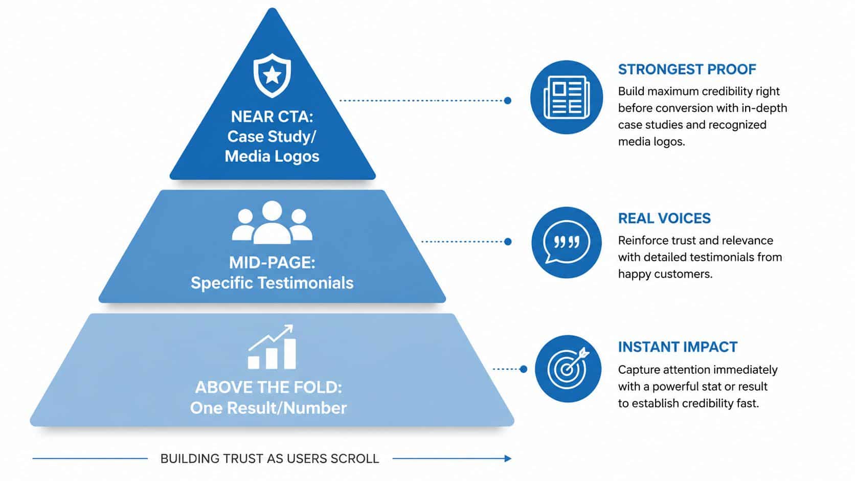
Generic testimonials are weak because they answer the wrong question. A visitor doesn't need proof in the abstract, they need the right proof at the right moment in the decision. That's why social proof works better as a hierarchy than as a wall of logos and quotes.
Match proof type to the objection
Above the fold, the proof should establish immediate credibility. A named client logo strip, one recognizable testimonial with a face, or a specific audience stat can do that job cleanly. What doesn't work as well is a generic five-star badge with no name attached, because it signals approval without telling the visitor who approved.
Mid-page proof should answer the objection that appears at that point in the scroll. If the section is about implementation effort, show proof that the setup was simple. If the section is about cost, show proof that frames the value relative to the result. If the section is about fit, show proof from a customer who looks like the buyer reading the page.
Near the CTA, the proof should reduce final hesitation. Guarantees, security cues, and reassurance lines work here because the visitor is no longer asking whether the offer exists, they're asking whether it's safe to proceed. A clean closing proof block can do more work than another paragraph of feature copy.
For local services, proof usually has to feel personal and specific. For SaaS, proof can lean on recognizable customer names, workflow outcomes, or a visible product result. For info products and courses, proof has to make progress feel realistic without sounding inflated.
The critical distinction is actual proof versus decorative proof. A badge with no context rarely moves a skeptical buyer. A recognizable customer quote, placed near the question it answers, usually does.
Proof doesn't persuade because it exists, it persuades because it resolves a doubt.
If you want a structured way to think about lead quality and follow-up fit, the ready-to-sell lead ranking system is a useful reference point for mapping proof to qualification. The broader lesson stays the same. Social proof should be sequenced, not scattered.
Design Layout Forms and Mobile Speed as One System
Layout, forms, and mobile speed usually get discussed as separate workstreams, but they're one experience to the visitor. If the page is visually clear but slow, the promise weakens. If the page loads fast but the form feels awkward, the promise breaks at the finish line.
Keep the eye on one path
The strongest pages use visual hierarchy to guide attention, not entertain it. One focal point, one CTA path, no navigation leaks. Shorter pages can outperform longer ones by roughly 13% to 15%, which is a reminder that trimming clutter often helps more than adding sections (Brandywebs).
Forms deserve the same discipline. Reducing a form from 11 fields to 4 fields has been associated with a 120% increase in conversions, while single-objective pages have been reported to convert 266% better than pages with competing calls to action (Involvedigital). Those figures don't mean every page should be minimal at all costs. They mean every field has to justify itself by improving qualification, not by satisfying internal curiosity.
A field belongs on the page if it changes the sales process, qualification flow, or follow-up quality. If it doesn't do one of those jobs, it's probably friction. That's especially true on mobile, where each extra tap feels more expensive than it does on desktop.
Treat speed as part of conversion design
Page speed isn't a technical vanity metric. It's a conversion variable. Guidance focused on landing-page execution recommends measuring Core Web Vitals before launch and pushing mobile Largest Contentful Paint below 1.5 seconds or, at minimum, keeping load time under about 2.4 seconds (Brandywebs). The same guidance also notes that a 0.1-second speed improvement can increase conversions by 8% to 10% (Brandywebs).
| Core Web Vitals Targets for High-Converting Pages | ||
|---|---|---|
| Metric | Target | Conversion Impact |
| Largest Contentful Paint | Below 1.5 seconds on mobile, or under about 2.4 seconds as a practical ceiling | Faster load times reduce friction before the CTA is even seen |
| Interaction readiness | Validate INP before launch on a real device | Faster response supports form completion and tap confidence |
| Visual stability | Validate CLS before launch | Less movement means fewer accidental exits and mis-taps |
Desktop emulation misses the friction that matters most on paid traffic. Real-device testing catches tap-target issues, script lag, and mobile form behavior that lab scores can hide. A useful workflow is to test on an actual phone, strip unnecessary scripts, verify that forms are easy to complete with one hand, and check whether the primary CTA remains obvious on every screen size.
This is also where tools matter. A single dashboard for marketing ops can help teams keep the page, the form, and the follow-up path in one working view instead of bouncing between disconnected tools. The best page is still the one that feels simple on a phone.
Track Test and Decide What to Ship
A landing page isn't finished when it goes live. It's finished when the team knows what changed, what happened, and what to do next. The difference between a decent page and a compounding system is usually the quality of the testing discipline.
Instrument before launch
The first mistake is launching without event tracking. At minimum, the page should record page view, CTA click, form start, form complete, and a quality event tied to the actual revenue outcome. Without that chain, teams end up arguing about vibes instead of behavior.
Practical rule: if you can't explain what the page taught you, the test didn't really finish.
The second mistake is changing multiple things at once. If the headline, hero image, and CTA all change together, nobody knows which variable mattered. A clean A/B test isolates one variable, starts with a clear hypothesis, and respects a sample-size threshold instead of stopping the moment the graph moves.
I like to treat tests as decision memos. Write down what you expect to happen, why you expect it, and what action you'll take if the variant wins or loses. That's more useful than running a string of random experiments that never build a pattern.
Test the variable that matches the problem
Headline tests are for promise clarity. CTA tests are for action clarity. Form-length tests are for friction. Proof-placement tests are for trust timing. Hero-image tests are for attention and fit. Not every page needs all of them, and not every business should start in the same place.
If the traffic is good but the visitor feels confused, test the headline. If the page gets clicks but not completes, test the form. If the page converts but the leads are weak, test qualification friction and proof placement together with the follow-up process. For measurement and reporting workflows, turn data into decisions is the right mindset.
HighLevel fits naturally here because it combines page building, built-in forms, analytics, and A/B testing in one environment, which matters when the issue is less about ideas and more about execution speed. The point isn't the tool itself. The point is reducing the lag between a test idea, a page change, and a measured outcome.
The strongest optimization programs don't chase one winner and stop. They build a backlog of learnings that raises the baseline over the next few quarters. That's how a page becomes a system instead of a one-off asset.
Your 30-Day Landing Page Launch Plan
A workable launch plan has to fit into real agency life, not a fantasy sprint. The cleanest path is to separate strategy, copy, build, and validation so each step has a finish line. That keeps teams from polishing design before the message is ready.
Week by week execution
Week 1, goal and traffic audit. Lock the single conversion goal, review the traffic source, and write the message-match brief. If the page is being built for multiple ad groups, split them before anyone opens the design tool.
Week 2, copy and proof production. Draft the headline, offer, CTA, and proof stack before design work begins. This is also where the proof hierarchy gets decided, so the page doesn't end up with random testimonials dropped in at the bottom.
Week 3, build and instrument. Assemble the layout, reduce form friction, validate mobile behavior, and install event tracking. Check the page on a real phone, not just in a browser preview, because that's where too much paid traffic lands.
Week 4, soft launch and decision-making. Watch the first wave of conversions, document the baseline, and queue the first test only after the page is stable. If the page is underperforming because the promise is wrong, no amount of button-color testing will rescue it.
A rebuild is smarter than a tweak when the traffic-source mismatch is obvious, the offer is unclear, or the page is trying to sell to mixed intent. Those are structural failures, not optimization problems. Testable pages need a stable foundation first.
The bigger takeaway is simple. A high-converting landing page is built campaign by campaign, proof layer by proof layer, and test by test. When the message matches the click, the CTA asks for one thing, and the page removes avoidable friction, the page stops acting like a brochure and starts acting like a conversion system.
If you want to build that system faster, explore HighLevel for landing pages, forms, automation, and analytics in one place. It's built for agencies and small teams that need one workspace for capture, follow-up, and tracking without stitching together a dozen separate tools.
